Format Festival Derby

http://www.formatfestival.com

Today we visited to the Format Festival in Derby. Format International Festival was established in 2004.

‘Today it is one of the UK’s leading international contemporary festivals of photography and related media.’ 

Format organises international commissions, open calls, residencies, conferences and collaborations in a year round programme in the UK and internationally. This festival showcases a variety of work from new photographers to some of the best-known practitioners in the world.

In this years addition of this festival, all the work explored the theme of ‘HABITAT through varied narratives and imagery that document the worlds around us.’ The theme of HABITAT looks a range of studies including landscape, environment, mobility, migrations, digital worlds, idea of home and displacement, conflict and regeneration and all the space we live.

Below is a map of the all the different places you can visit within this festival. These places are all located around the city centre of Derby.

Screen Shot 2017-05-07 at 13.03.05.png

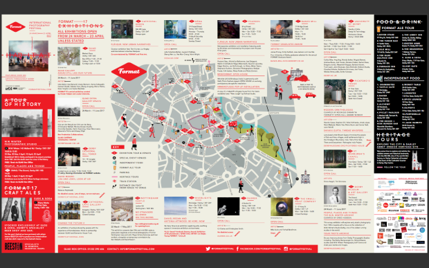
This is a map of all of the places you could go to that were exhibiting work for the Format Festival.

The first place we visited was number 8, which was located at the University of Derby.

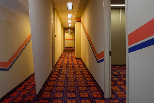
One of the photographers that really caught my interest within this venue was Barbara Karant. The project that was presented within this venue was documenting the core essence of the Johnson Publishing Company, which to this day is one the most influential African American-owned corporation. The photographs  focus on the lively interiors within the building which embodies the creativity of the staff working in a variety of media, including the iconic Ebony and Jet Magazine.

Barbara Karant.jpg

Barbara Karant image

The image above is one of the images from Barbara Karant’s project based on the lively interiors within Johnson Publishing Company. This particular image caught my attention due to the contrast of colours and the 70s/80s styled patterned carpet. The location of this images reminded me of one of the scenes from the film ‘The Shining’ , a British-American psychological horror film based on a book written by Stephen King. The reason it reminds me of this film is because of the location and also the way the image has been taken.

The shining image

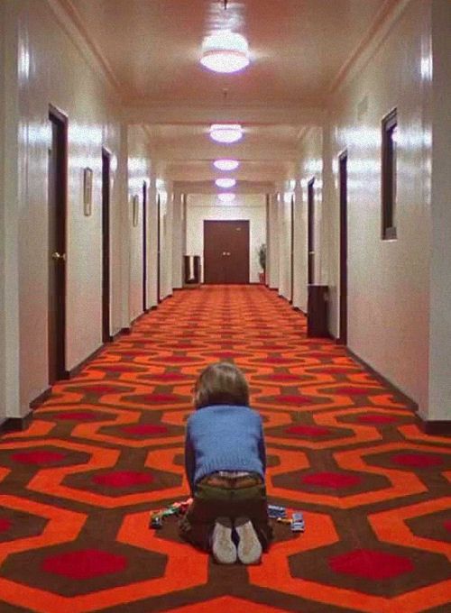
Image from The Shining

The second place we visited was number 1, which was located at the QUAD within the Market Place in Derby.

One of the photographers that really caught my attention within this venue was Katrin Koenning. The work that was presented was from the project The Crossing. This project is focused around the Australian landscape and the ‘human impact on an ecology in which our legacy is carved sharply into everything we’ve touched.’ Koenning’s work is about engaging with the broken relationship between the natural world and humans.

Screen Shot 2017-05-07 at 12.12.00.png

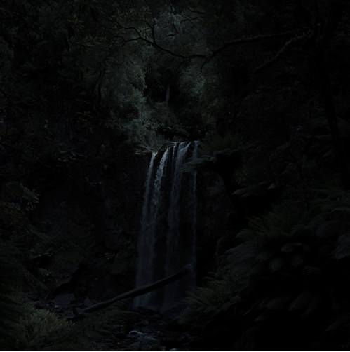
The image above is one of the images from Katrin Koenning project based on the relationship between humans and the natural world. The image has been taken during the night in the Australian landscape; this means that some of the landscape is difficult to see. By doing this it makes the viewer move closer towards the image when it presented in an exhibition to try and understand what is included in the image. Also, this could be displaying a metaphor saying that a lot of the human race are in dark about what is happening to the natural world. When it comes down to how Koenning lit the image, was a speedlite used or a portable larger lighting used or was this all done of editing program such as Photoshop or Lightroom.

Screen Shot 2017-05-07 at 12.27.54

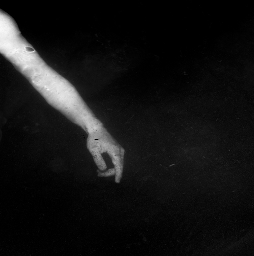
The image above is one of the images that is presented alongside the Australian landscape images. By doing this it shows the different between the natural world and human and it makes the viewers understand more about the concept of the work.

The third place we visited was number 6, which was located at Pearson.

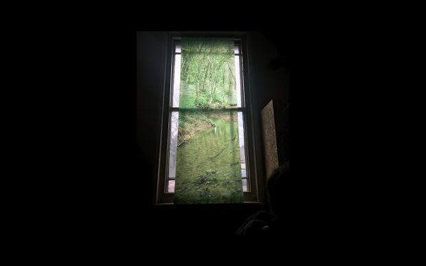
One of the photographers that caught my attention within this venue is Bostjan Pucelj. Unfortunately, this photographer did not include any information with the work that was presented. I do not know if this was intentional to make the viewers come up with their own ideas about what the work was about. The reason this particular piece of work caught my attention was because of the way the images were exhibited. All the images were printed on some type of translucent material such as acetate and attached to the ceiling and presented over the top of the window within this venue. I believe this worked well due to the fact that it brought out the colours more within the images and also made you think that the images were taken during daylight hours. When looking at these images I believe that it could have been talking about the relationship between humans and natural similar to Katrin Koenning’s work. Based on the images I saw I believe that the images could have possibly been taken in UK due to the colour of the landscape.

Screen Shot 2017-05-07 at 13.16.07.png

Bostjan Pucelj’s work

Overall, after visiting this festival I have been inspired by a variety of different photographs that photographed the same theme in different ways. Based on this idea, I could set myself one single broad theme for a project and see what sort of things I could up with; this means that I would be setting myself some restrictions but not too many. Another thing that has inspired me is the different ways that the photographs presented their work by using different materials and spaces within one area.


Jessica Lennan Guest Lecture

Jessica Lennan Guest Lecture:

Our guest lecturer today was Jessica Lennan, a photographer, Lecturer and Co-founder of Dod Photo and lived and works in Berlin and the Southwest of England. Lennan is well known for making books and making sense of photographs.

Lennan was a student in Berlin, where she and 9 other students were taught by documentary photographers about the power of photography. After completely her studies in Berlin, she has began her masters in the UK, where she focused on book making, mainly creating little books that she named as episode books. All of these books were A5 with the same layout, which told different short stories. These books have different coloured covers and Lennan was restricted to 24 pages.

This idea of making smaller books has really interesting me and has sparked some ideas for one of my latest project. The idea of creating episode books could relate to my latest project about the effects of social media on teenagers and I was doing a study on one teenager. My subject has experienced cyberbullying, insecurity and confidence on social media. I could use Lennan’s idea of episode books and show the different stages of my subjects life on social, so have one book for the cyberbullying and so on.

The first episode book was created in Paris and took the idea of film strips to show her images. The film strips were also accompanied by subtitles. Lennan’s work is all about experimenting with different book layouts and making viewers look at books in a completely different way to which they are used to. One example of this is in one of her books she repeats the same image throughout the book. This book was based on the idea that the viewer not an image and then they have to look at it similar to a flip book. The image within this book was an image of father injured and bleeding.

‘I had blood on my hands’ – Lennan referred to when she took the image.

This idea of showing an image repeatably is possibly something that I could use within my work. Rather than creating a book or a sequence that repeats just the same image I could create a sequence where one image keeps popping up in the sequence.

My favourite book that was shown with this guest lecture was Winterschlaf.

http://www.jessicalennan.com/Winterschlaf-The-Book

This book describes ‘a state of being during the dark winter months.’ The photographs show the light within these winter months and also how absence the light can be during these months. Each book also contains one instant image of summer; this is a metaphor for storing nuts for the winter. By doing this, it also shows the contrast between winter and summer and showing the ‘balance of abundance and scarcity.

Screen Shot 2017-05-06 at 19.27.38.png

The image presented above shows my favourite layout and image within this book. This layout shows the contract between summer and winter and the change in light. The winter image shows how light comes from artificial sources e.g. the lights within the different rooms within the house. While, the summer images shows that the light comes from a natural source and is more direct. I also like how the images are different size and in my eyes it could represent the idea the winter is the bigger picture and is happening right now and the smaller images which represents summer is something we are waiting for.

Overall, I have learnt that you can create simple book layouts which represent bold messages and you can change the way viewers look at an image just through the layout/sequence of images.


Branding and Logo

When creating logos, you have to consider what font you are going to use and what you want your logo to say about you and your business. Your logo can be simple and can just be your name.

Screen Shot 2017-05-06 at 21.08.45 
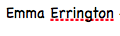
– this is the font Chalkboard and can be associated with school and children. Based on this I would not use this as the font for my logo.

Screen Shot 2017-05-06 at 21.08.51 
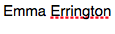
– this is the font Helvetica and can be as a simple and possibly boring font. However, this font is readable and could be seen as professional. Based on this, I believe that this font wouldn’t represent the service I would be providing and could be seen as boring.

Screen Shot 2017-05-06 at 21.08.55 
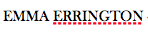
– this is the font Baskerville Old Face and can be seen as professional and simple      to read. Based on this I could use this for my logo.

LOGO

These are two different simple logos I have created using Baskerville Old Face.

Logos can be placed on business cards, your website, letters, invoices, contracts and forms.

Logos do not have to designed by you, you can pay people, such as a graphic designer or web designer, to create it for you. However, one thing you have to ensure is that the branding for your business is unique and represents you as person.

On invoices you should include your logo, contact details, company house number and VAT, contact information for the client, service or the thing that you sold and the price, TAX or VAT added. If you don’t have an accountant make sure that you keep a record of all of the invoices. Over time you can begin to add subtle changes to your logo; this shows clients that you are processing in your branding and that your business is developing.

You should also include different payment methods within your invoice. Examples of these are PayPal and Stripe. Before a client pays for your service, you should state that the payment is to be expected within 21 days and you will charge more if they do not pay after 3 months e.g. 10%.

PayPal:

https://www.paypal.com/uk/home 

PayPal is an American company operating a worldwide online payments system that supports online money transfers and serves as an electronic alternative to traditional paper methods like checks and money orders.’

The services offers several different solutions on how to use PayPal e.g. having a link on your website to allow your clients to pay through PayPal. All the solutions are presented below.

Screen Shot 2017-05-06 at 11.49.49.png

This service also can help your business create invoices.

Stripe:

https://stripe.com/gb 

‘Stripe is a US technology company, operating in over 25 countries, that allows both private individuals and businesses to accept payments over the internet.’

The service provides online payment system that you are only charged for when it is used by you. Depending on the type of card your clients use Stripe get a percentage of the transaction.

This slideshow requires JavaScript.

One piece of software that can be used to create invoices and is specifically for photographers:

https://www.lightbluesoftware.com

Screen Shot 2017-05-05 at 14.18.47Screen Shot 2017-05-05 at 14.19.38

For this service, you have to pay depending on what you require from this service. The prices are presented above.

With this site, you can add in your information for your company, which is usually placed at the bottom on the page and add options for payment for each invoice. Within the invoice, you have to include an invoice number and date; make sure this is chronological order. A good tip for a new business is to do not start your very first invoice with the number one, pick a random number such as 0050; this will allow clients to trust your business and shows client that you are a business that is reliable.

One downfall of this service is that the outcome is not very well designed and is not aesthetically pleasing; this may not represent a creative business very well.

Branding your business:

You can brand your business in many ways including business cards, stickers, postcards etc.

On a business card, you can simply have your information on them and possibly one of your best images on the other side. Make sure to that the design is not too complicated, just a subtle design.

Three companies that can be used to create these marketing tools are printing.com and Vistaprint.

printing.com

http://www.printing.com/uk/choose-your-product/business-cards

This service produces materials for local businesses and personal use. The service started in 1994, when the CEO began creating flyers for night club owners.

This service creates business cards with strong colours, however this service can be quite expensive. If you use this service try to find offers as they have 6-8 products on offer each month.

This slideshow requires JavaScript.

Vistaprint:

This slideshow requires JavaScript.

This service creates cheaper marketing tools compared to printing.com, however if you wish to create these products using coloured be warned that the colours aren’t as strong compared to printing.com.

One marketing product that works well for photographic business especially is postcards. Postcards are something that clients would keep if they required your services again, mostly likely end up being stuck on the fridge if they look good. With postcards, keep the image and logo on the front and leave some blank space which can allow you to write a personal message to the client on the back. By doing this is free advertising for your business as people can begin to recommend you.

Contracts and Forms

  • Orphaned Images : Images that have been stolen and this allows you put extra data into your images. Putting extra data into your images can also be done on your camera or within the Adobe program Lightroom.

When you post an original images created by you on the social media website Facebook, your copyright is stripped away whenever you post; this is due to the fact that when you agree to the terms and conditions you sign away your rights. To avoid this you can put watermarks onto your work and preserve your work.

Contracts:

Contracts are agreements between two or more parties.

You can start verbally under the British contract law, however by doing this there is no proof. You have to make sure that the contract is in writing.

Within a contract if things change and the boundaries change this is known as a Mission Creep. 

When creating a contract, you have to make sure that things are made clear at the beginning and that it is discussed in full detail. Another thing to consider is that both parties have to understand what the contract is saying and if one party doesn’t make some changes or explain it to this party.

Agreement should be verbally first and then in writing; this means that you have proof of the communication between both parties. Once in writing, email the other party a copy of the contract in writing. Whenever creating a contract and confirming the contract make sure that the final decision is the clients as they are the one paying for your services.

Make sure that the client is fulfilling each side of the contract so they don’t mess you around.

The contract covers you and that why creating a contract can take a long time. Whenever you create images for a client the copyright will always be yours, however if the client wants the copyright they will have to pay it out. The client don’t have to the copyright to use the images, they can be licensed to use the images.

Screen Shot 2017-05-06 at 20.46.38.png

Copyright is the thing that allows us to retain an income.

Screen Shot 2017-05-06 at 20.47.12.png

PRS for Music Limited is a collection society for songwriters, composers and music publishers who license organisations to play, perform or make available copyright music on behalf of their members and overseas societies, and distribute the resulting royalties to them fairly efficiently. This is done by paying an annual fee and their music can be playing in a public place e.g. cafes, shops.

http://www.prsformusic.com/Pages/default.aspx

DACS is the photographers version of this and is best for editorial workers. This has been established by artists for artists and is a not-for-profit visual artists’ rights management organisation.

https://www.dacs.org.uk


Model Release Forms: 

A model release form is a legal document between you, the photographer and the person or people who owns the property you’re photographing. This is the written form of their permission allowing you publish their images as a marketing tools whether it is on your website, blog etc. Model releases spell out the compensation for the model or photographer depending on the situation.

A model release is a form that is needed when you take an image of a recognisable person or identifiable feature e.g a tattoo; this means that the form isn’t just needed for professional models, but to anyone who is photographed.

The form will protect you, as a photographer, will protect you against civil liability law should an issue arise in the future. It protects all parties involved, including the subject who is being photographed.  This will also be needed if you decide to license the images at a later date; this means that you should keep a hold of all the model release forms you create.

The model release form should include your details, their details or modelling agency details, the price they will be paid and where the images will be used. As the photographer you have copyright, however the model can use the images.

Below are some examples of model release forms from different sources:

Screen Shot 2017-05-02 at 21.04.05Screen Shot 2017-05-02 at 21.04.12http://www.rps.org/news/2015/may/rps-launches-model-release-form

Screen Shot 2017-05-06 at 20.51.43.png

https://www.the-aop.org/information/downloads/legal-business-forms

Terms and Conditions:

Within this form you need to include your logo for your business and your information on the top of the document. VAT and company number should also be included. This form can be changed to the photographer and client; this means that all this form needs to say who they refer to. If the company is smaller, you can create a small form.

Below are some examples of terms and conditions form from different sources:

This slideshow requires JavaScript.

https://www.gov.uk/government/publications/short-form-terms-and-conditions

Screen Shot 2017-05-06 at 21.04.42

https://www.the-aop.org/information/downloads/legal-business-forms

If you were a social photographer you could consider using these forms. These type of forms inform and educate the client/s about copyright; this is something that professional photographers sell. The client/s can have visibility rights; this can be done by giving the client a disc with all the images on it or the images they want.

When creating these forms you have to consider putting in different clauses to avoid any problems with the client.

    • The photographer has the right to colour correct the images and the skin colour takes priority.
    • The photographer has copyright over the images and the client has visibility rights.
    • The photographer has permission to use the images for promotion and use the images online on a website for example.

For these type of forms make sure that there is a place for the client to sign and make sure the form is personal to that particular client e.g. if they didn’t want their images to be used a promotion you would add this into the form.